PetFinder Redesign
Improving Petfinder’s user experience to streamline pet discovery and make adoption easier and more accessible.
Role
End-to-End UX/Product Designer (Research, UX, UI)
Duration
3 weeks

Problem Overview
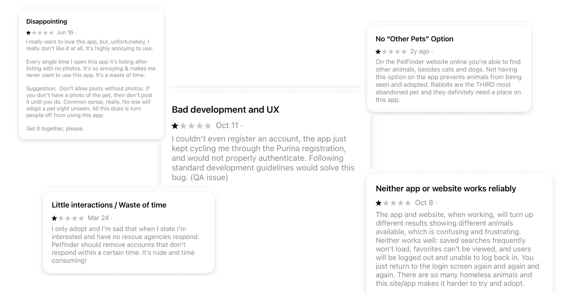
Petfinder users report difficulty finding adoptable pets due to confusing navigation, inconsistent listings, and unreliable app performance. Many reviews mention frustration with missing photos, inactive shelters, and limited filtering options — all of which create friction during an already emotional process.
Key Pain Points
Inactive shelters — Users often contact shelters that never respond or are no longer active.
Inconsistent listings — Many pets are posted without photos or clear descriptions.
Confusing search flow — Filters, saved searches, and results feel unpredictable and hard to use.
Missing features — No option to search for “Other Pets” such as rabbits or small animals.
Unreliable experience — Accounts fail to authenticate, saved items disappear, and users repeatedly get logged out.
How Might We Improve?
The current Petfinder app struggles with usability issues that make the adoption journey harder than it should be. By improving navigation, creating clearer pet listings, and designing a friendlier visual experience, this redesign aims to help people discover adoptable animals more easily. The goal is to create a warm, intuitive, and trustworthy platform that supports both users and shelters.
Research & Insights
Research Approach
To better understand user frustrations and opportunities, I analyzed app store reviews, explored the current Petfinder app, and compared it with similar adoption platforms. This helped identify patterns in user expectations and the biggest barriers preventing people from connecting with adoptable pets.
What I Learned
Users want an adoption experience that is:
Reliable — consistent listings, functional search, and no login issues
Clear — photos, up-to-date shelter info, and straightforward filtering
Encouraging — a friendly tone that supports an emotional decision
Inclusive — more categories (like rabbits and small pets) to avoid excluding animals
These insights shaped the direction of the redesign and guided every design decision.
Design Goals
Based on my findings, I defined four main design goals:
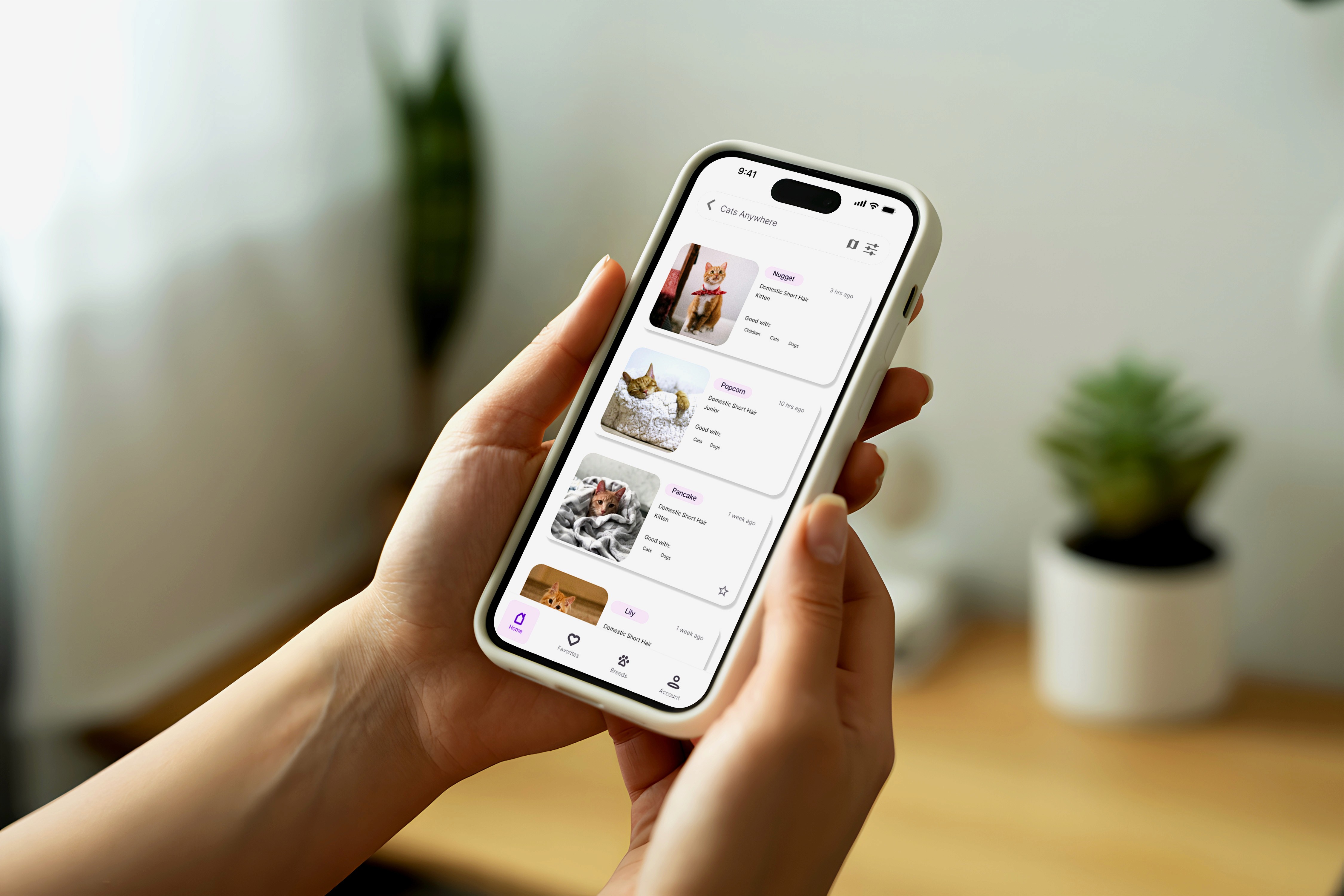
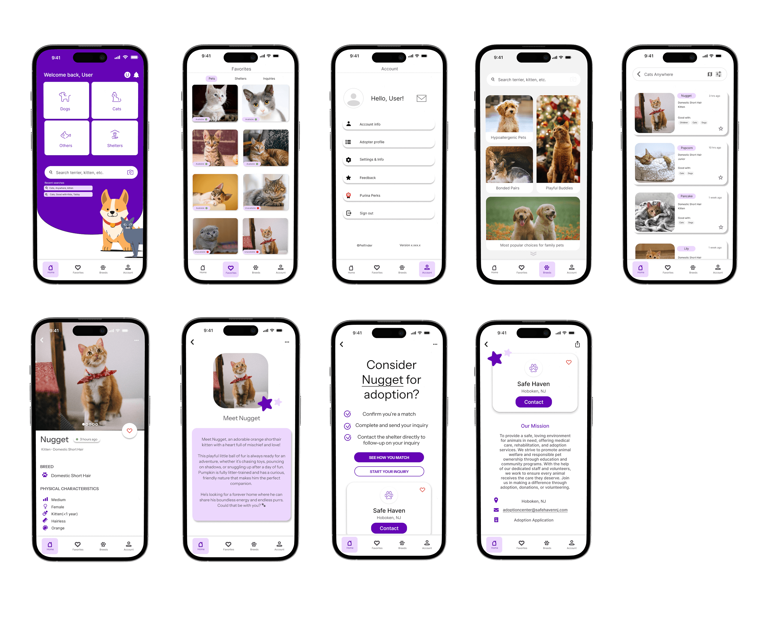
Simplify navigation so users can quickly find the type of pet they’re looking for.
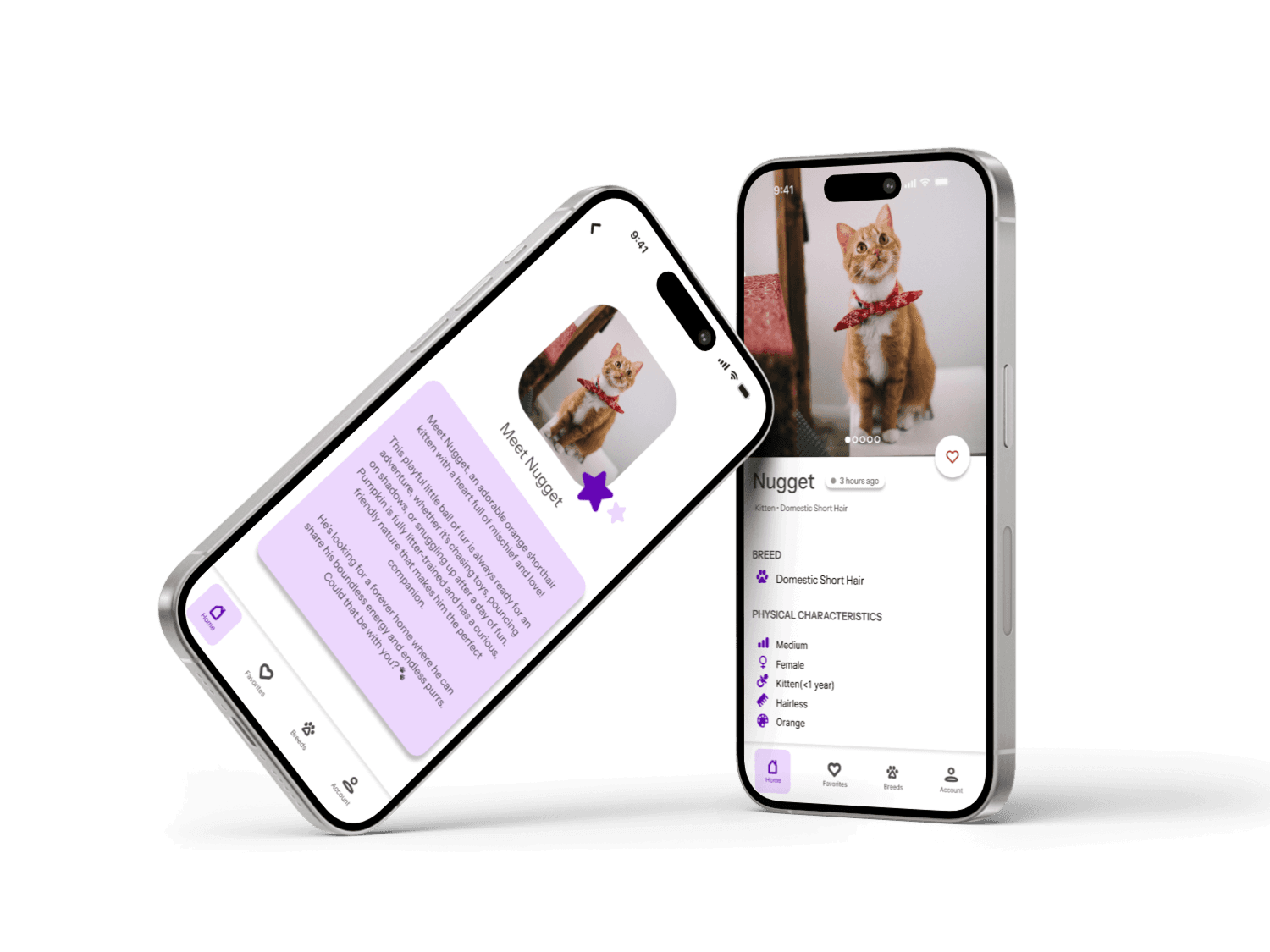
Improve listing clarity with required photos, badges, and updated shelter activity.
Make search intuitive by redesigning filters and enabling saved searches.
Create a softer, more welcoming visual style to match the emotional nature of adoption.
Key Outcomes
1. Improved Discoverability & Navigation
A restructured information architecture and simplified bottom navigation reduced cognitive load and allowed users to browse pets, shelters, and saved profiles with ease.
2. Increased User Confidence & Engagement
The redesigned experience reduces overwhelm, supports exploration, and builds emotional resonance — encouraging more users to take the next step in adopting.
3. Elevated Visual Identity
A modern, soft, and welcoming UI replaces the previously cluttered interface. The refreshed color palette, simplified iconography, and accessible typography make the app feel trustworthy and adopt-friendly.
Other projects

Syllabirb: The Smarter Syllabus

Triumph Motorcycle HMI Redesign

Reimagining Telecom Customer Service Journeys
This project explores how to improve the transition between AI chatbots and human agents in telecom customer support, creating a more seamless and less frustrating user experience.

Romanticism: Poetry Book Design
A typography-driven editorial book exploring Romantic poetry through layout, imagery, and motion.